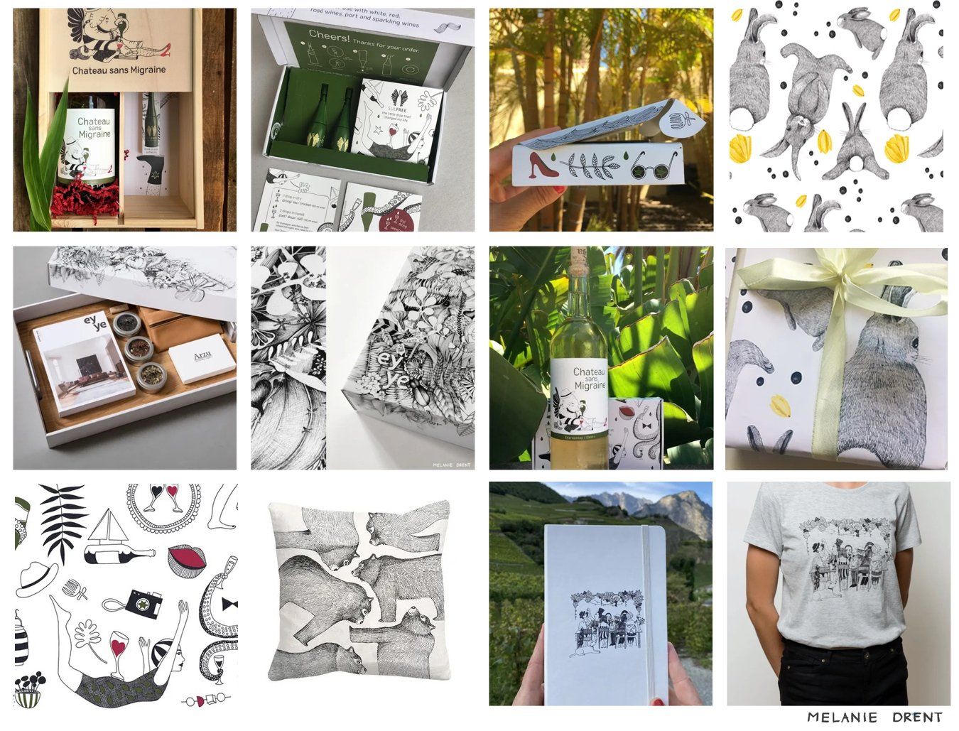
Brand illustration & packaging
A brand illustration system is an essential part if you want to design a packaging. It helps your brand tell its story.
With also a background in advertising and brand building, I look together with clients at what a brand and packaging needs in terms of illustration. And not just as a form, but especially with a concept behind it. A brand that is rock solid.
Nieuwe alinea
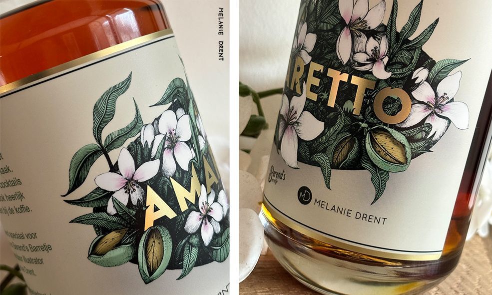
Amaretto Label
For Berend’s Barretje, the cocktail bar at Bühne, I was asked to design the label for their signature Amaretto.
Inspired by the origins of Amaretto—the almond and almond blossoms—I wanted to bring a sense of depth to the design. The hand-drawn illustration of the soft white-pink almond blossoms is showcased through an almond-shaped cutout in the label. The golden lettering echoes the rich color of the liqueur.
The sleek lines of the lettering are playfully interrupted by falling petals, creating a dynamic interaction. The warm, sweet tones of the design mirror the smooth, golden taste of Amaretto. It’s a design that celebrates the delicate beauty of this beloved liqueur.

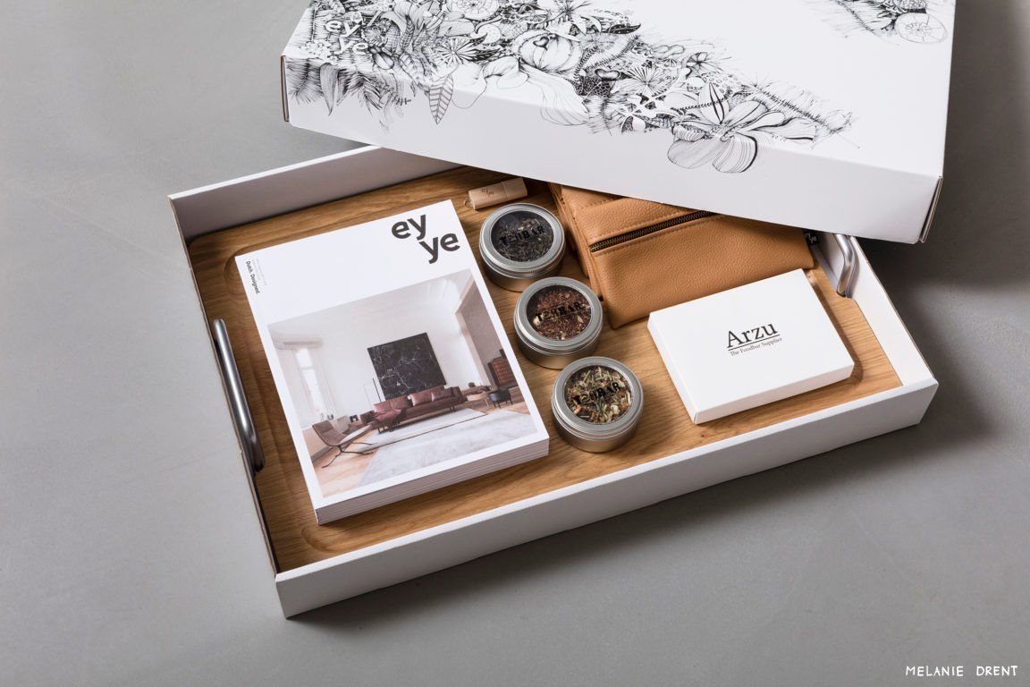
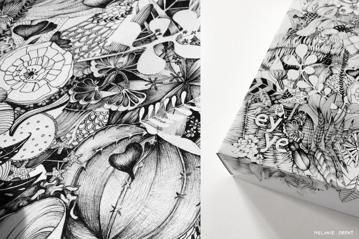
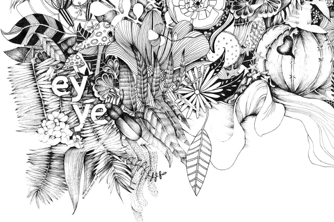
EYYE
Commissioned by EYYE - a young Dutch furniture brand - I made the design on the packaging of the presentation box below.This box is sent to new and future clients. EYYE is known for its craft, attention to details and natural shapesin her furniture. I have incorporated this into organic shapes on the box, matching the contents.
illustratie: Out of the box
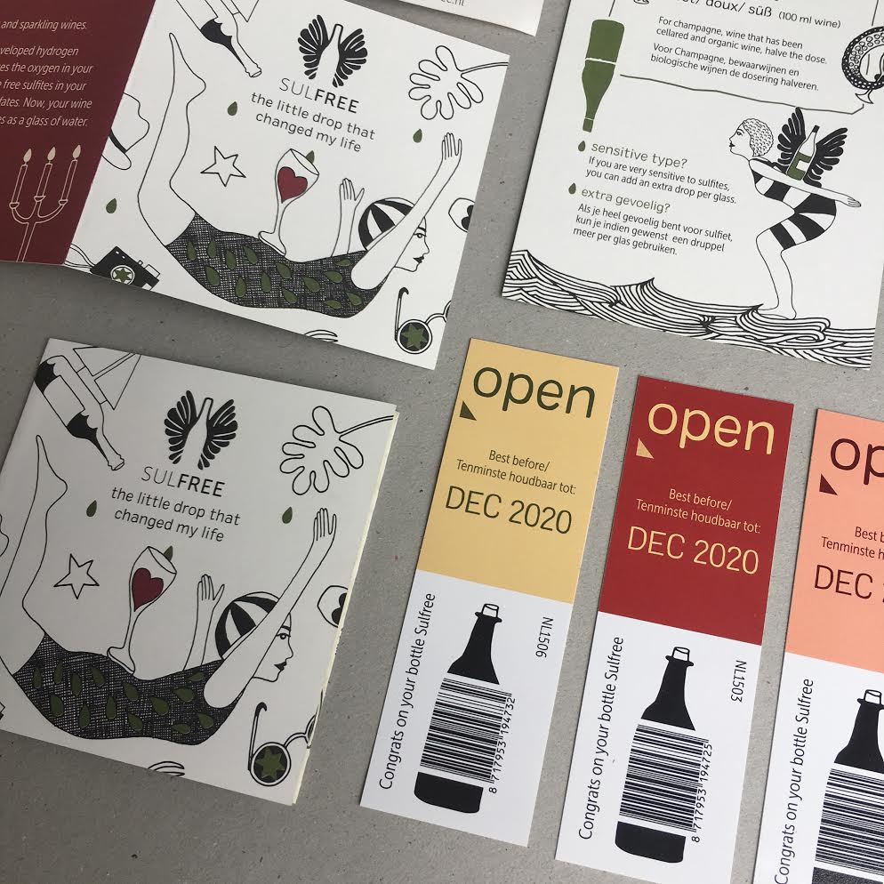
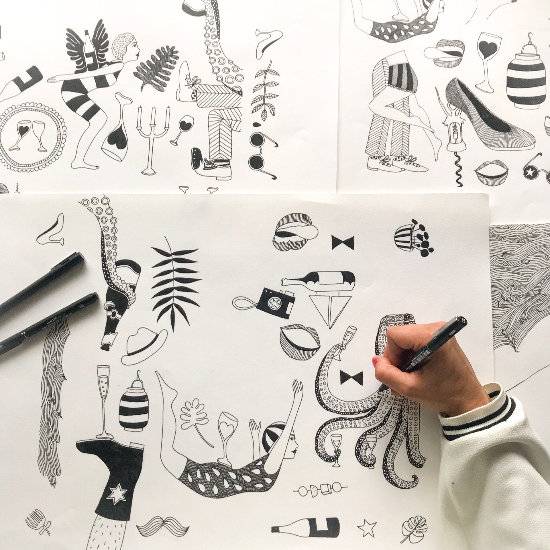
SULFREE packaging clip art
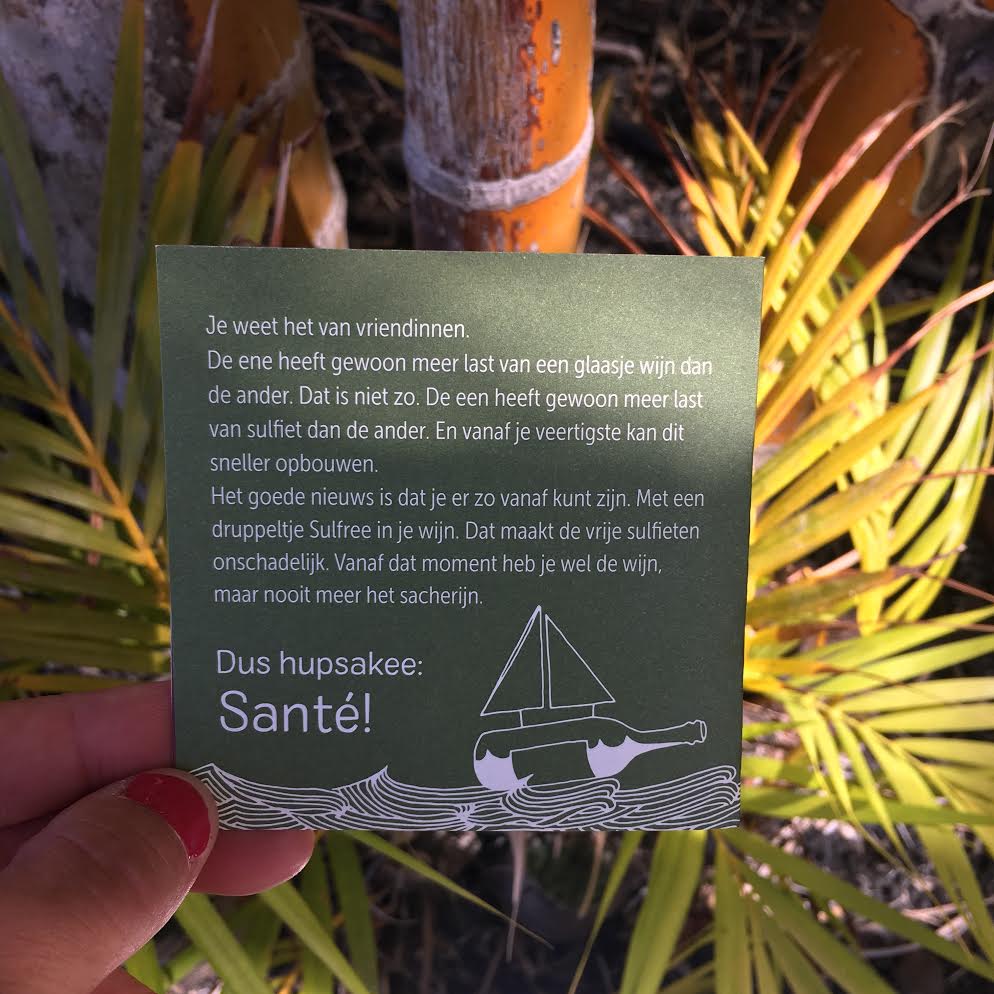
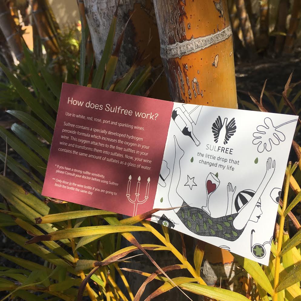
Sulfree asked me to design icons for the corporate identity. These icons are printed on a shipping box. Sulfree helps people who suffer from sulfites in wine to enjoy wine again. Because with 1 drop in your glass, Sulfree removes the sulfites from your wine. And that ensures that you do not get a headache from a nice glass of wine. Unfortunately, this product is no longer produced due to Dutch legislation.
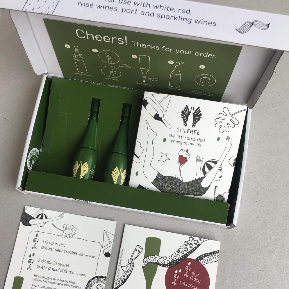
Contents of the package.
When you open the box, you are playfully thanked for the order. Here literally a new world opens up for you.
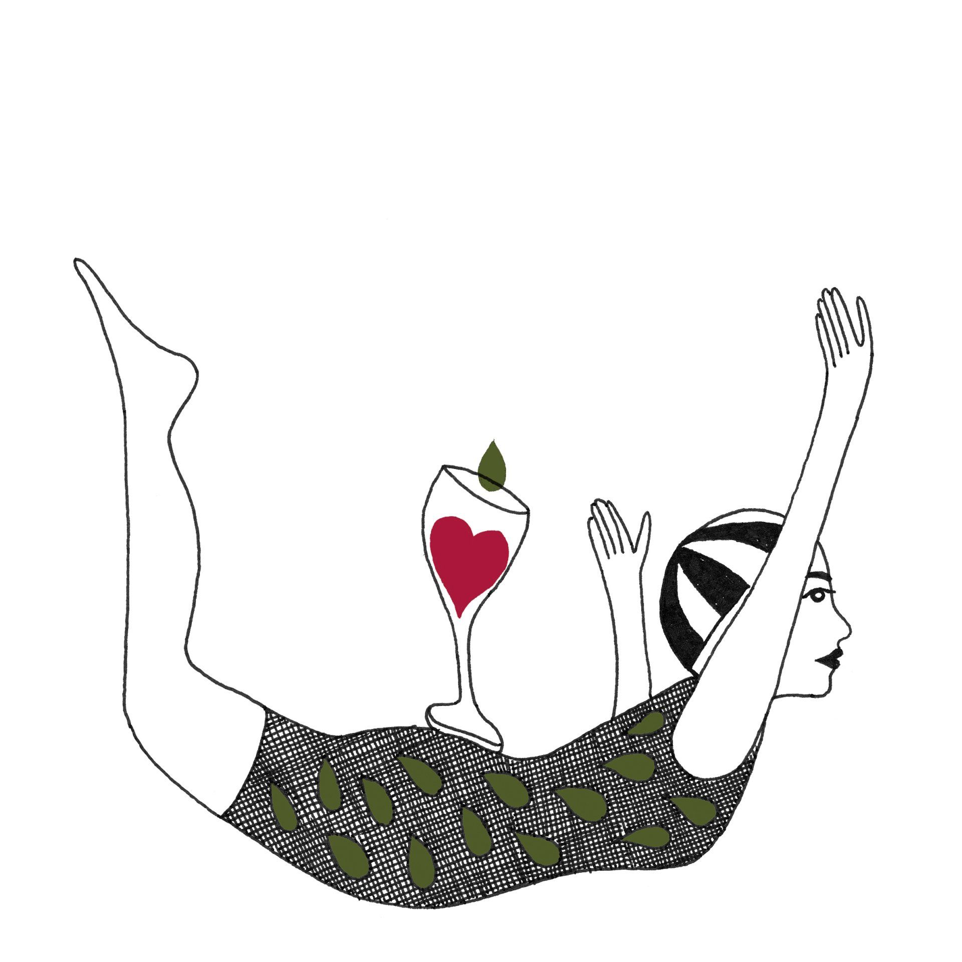
Illustration: Diving woman.
The diving woman in a retro bathing suit symbolizes freedom and the jump of happiness.
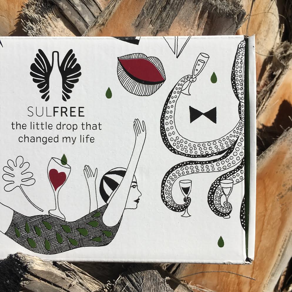
Top of the package.
On the box I made a pattern that continues over the box. In addition, there is a green droplet pattern on the box. Playful, with a nod to a free lifestyle.
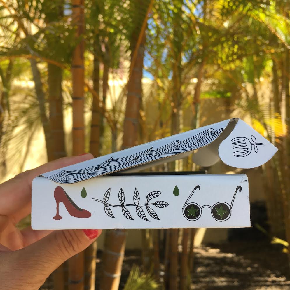
Side of the packaging design.
A Sulfree pattern can also be found on the side of the packaging. In addition to black and white, green (the color of Sulfree) and red have been chosen to convey the atmosphere of 'wine'/organic.
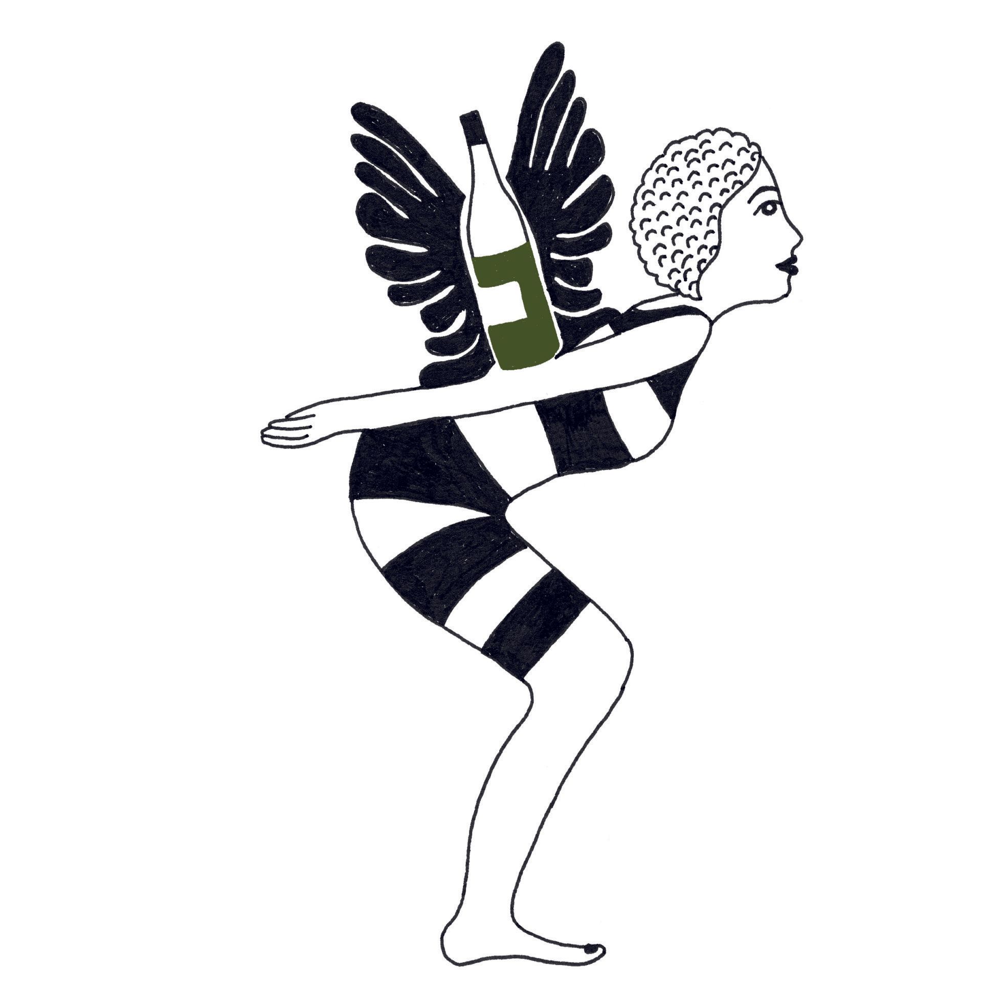
Outline Icons Style for Sulfree
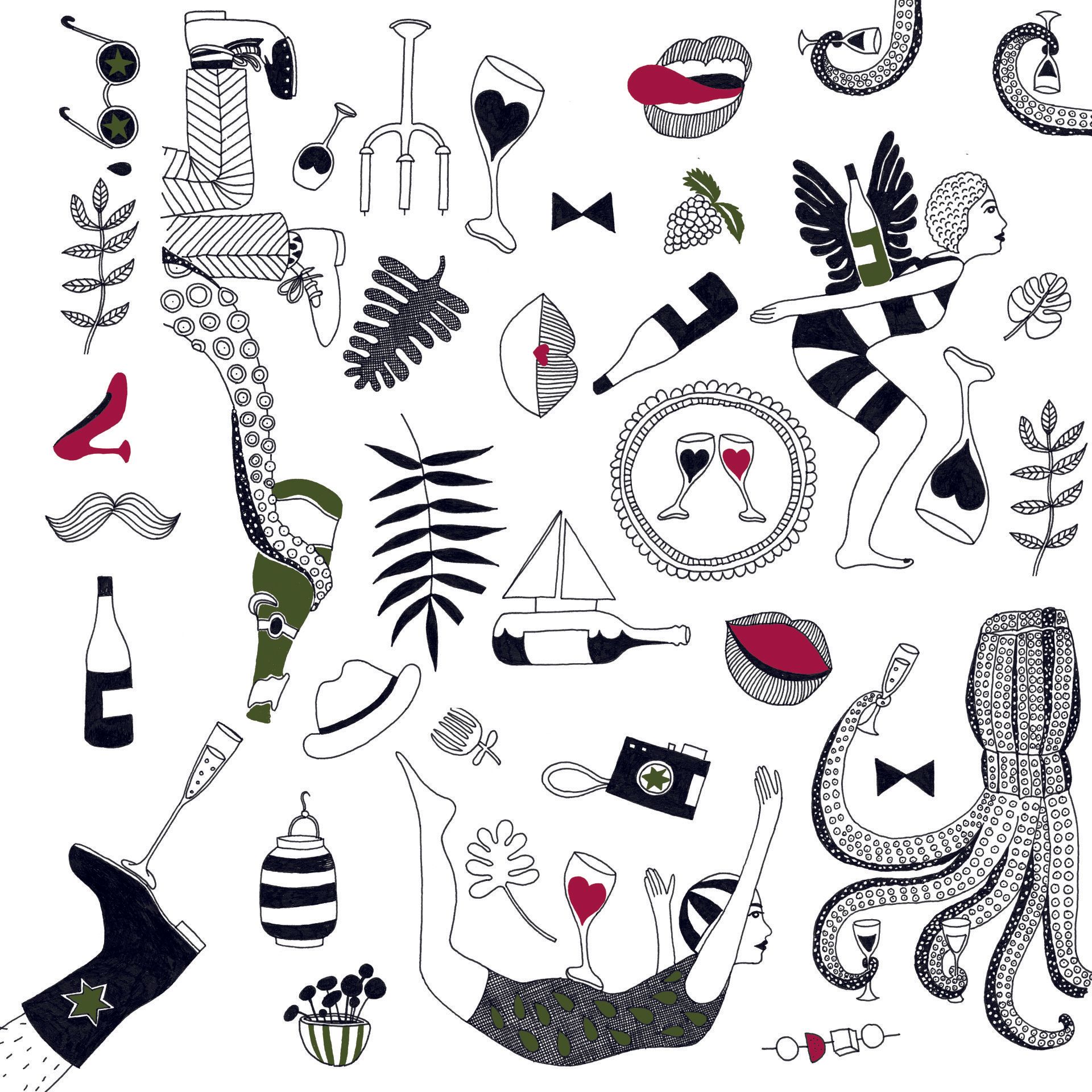
With the icons for Sulfree I looked for a style that appeals to both men and women. A style that suits freedom, happiness, living with a smile and a touch of mature youthfulness...
The little drop that changed my life..
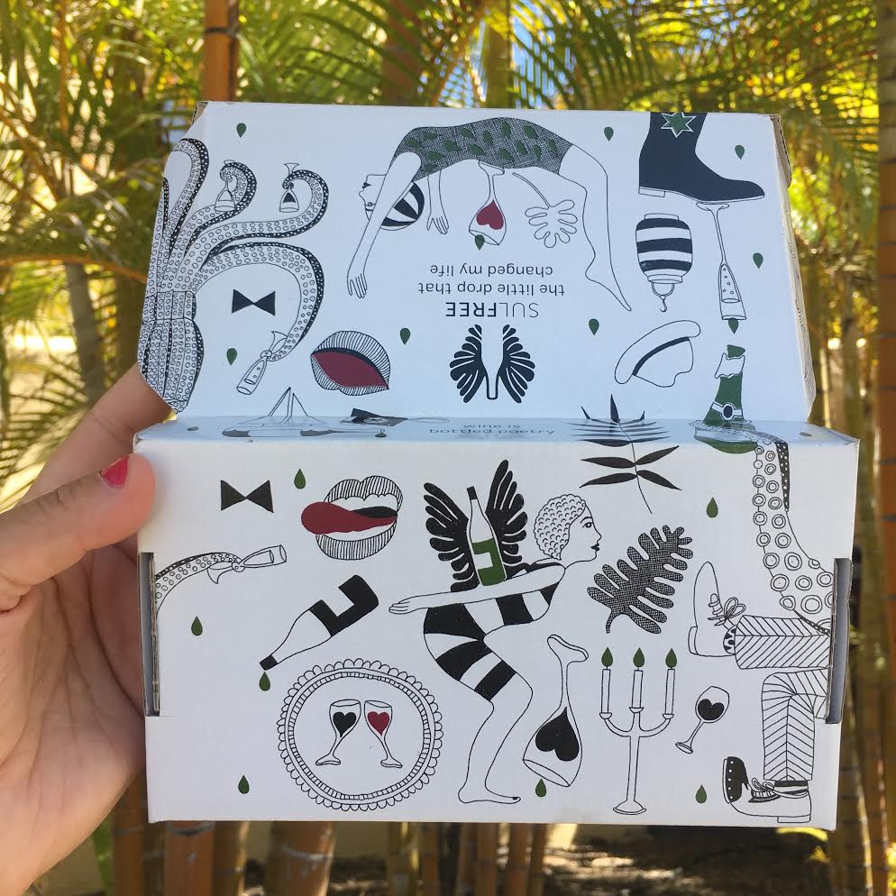
The back of the package where the pattern continues.
..
...
...
...
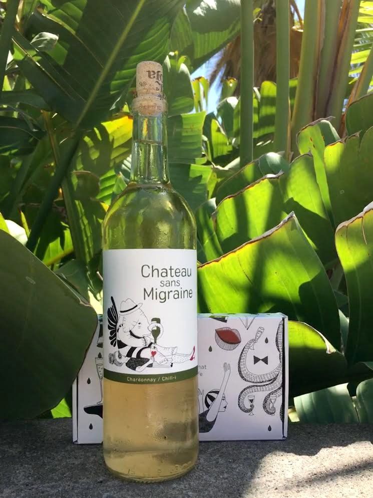
Chateau sans Migraine - Sulfree wine
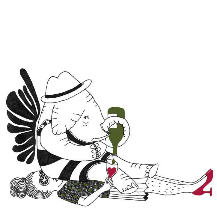
Chateau sans Migraine elephant
I made this illustration for the wine label for Chateau sans Migraine wine. A wine without sulfites, which is made in a limited edition and shipped in a wooden wine box.
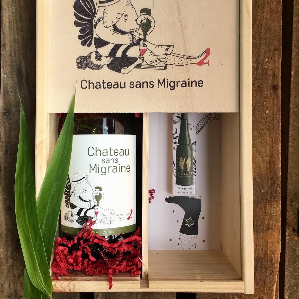
Wooden wine box with Chateau sans Migraine elephant.
The box contains a bottle of white Chardonnay / Chili with Sulfree.
In addition, a small bottle of Sulfree. The illustration is printed on the outside of the wine box.
You don't make a design like the one above alone. Below the credits for everyone
who worked on this:
Copy: Jeroen Tebbe
Art Direction: Brandbuilders
Client: Sulfree
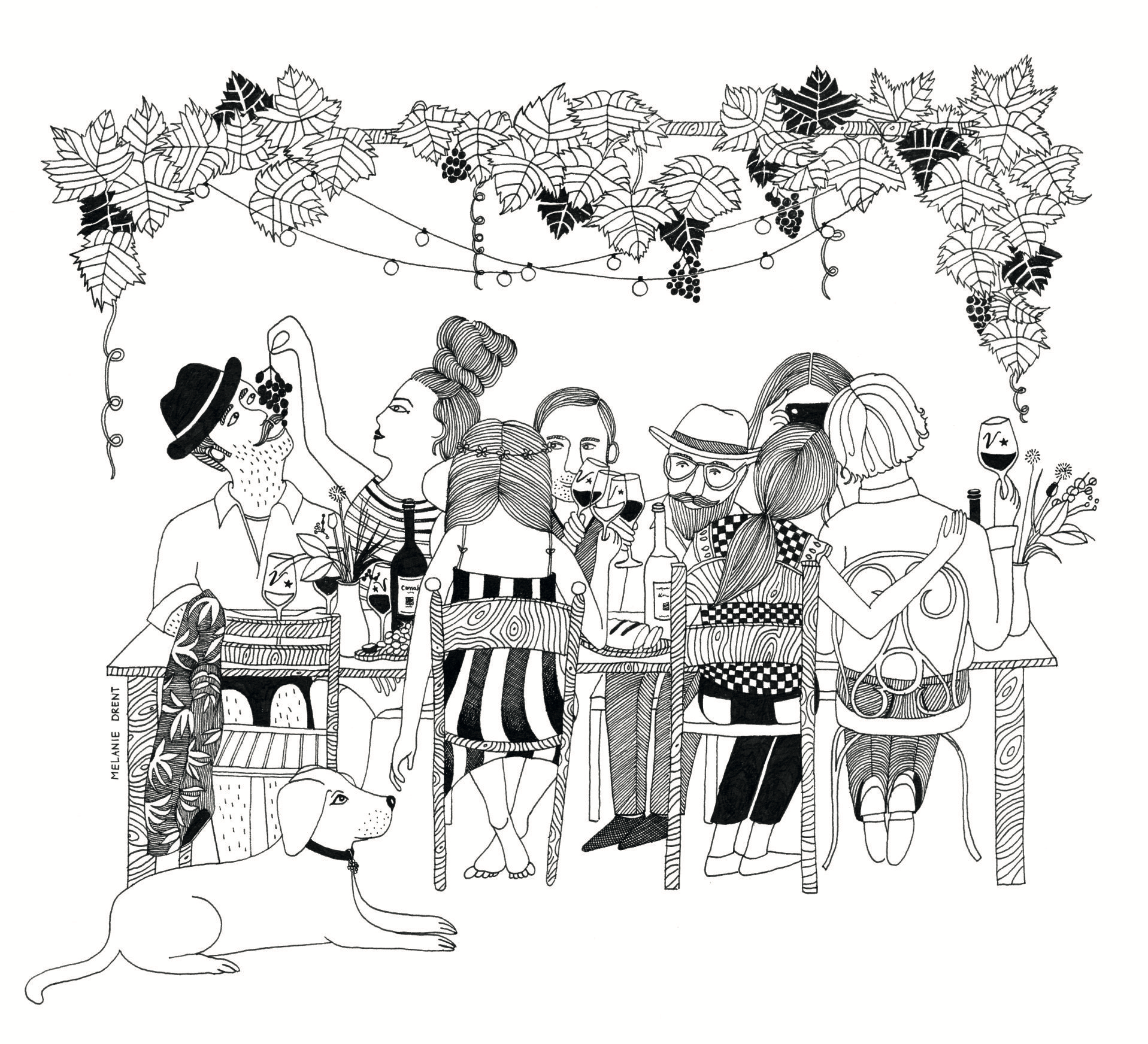
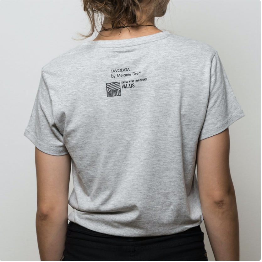
Swiss Wine Valais
The Swiss Swiss Wine Valais asked me to make an illustration for their wine brand. Valais is a well-known wine region in the French-speaking part of Switzerland. The illustration was allowed to portray a typical Tavolata setting. (Tavolata means happy people drinking Valais wine and dining together at a long table in a vineyard).
The illustration has also been used for a limited edition of white Moleskines, on a wine box and on T-shirts.
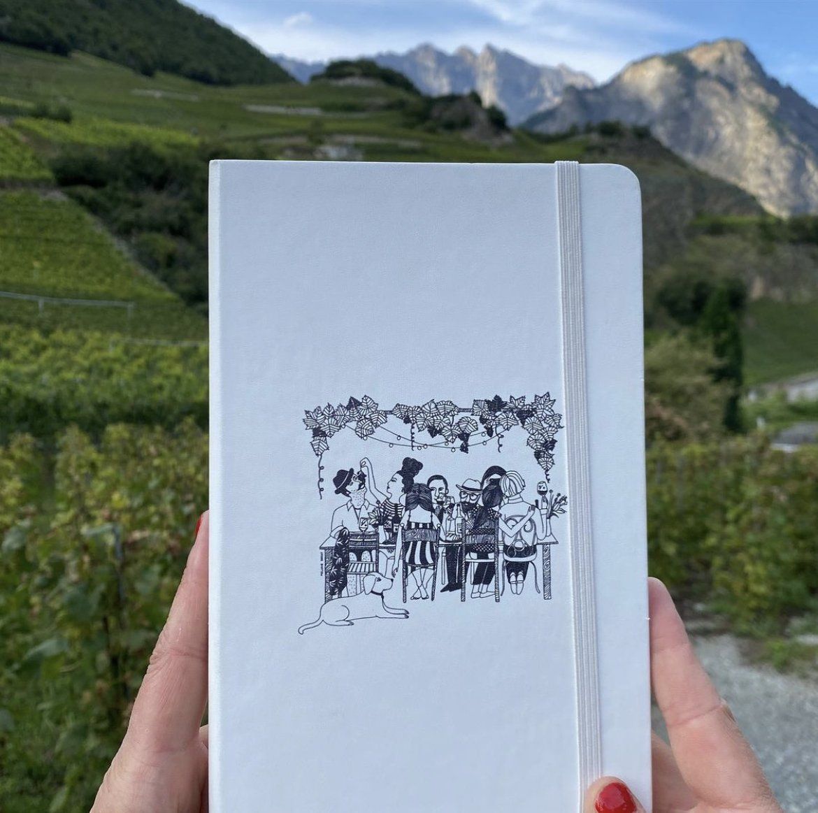
The Moleskine with the mountains of Saillon (Valais) in the background

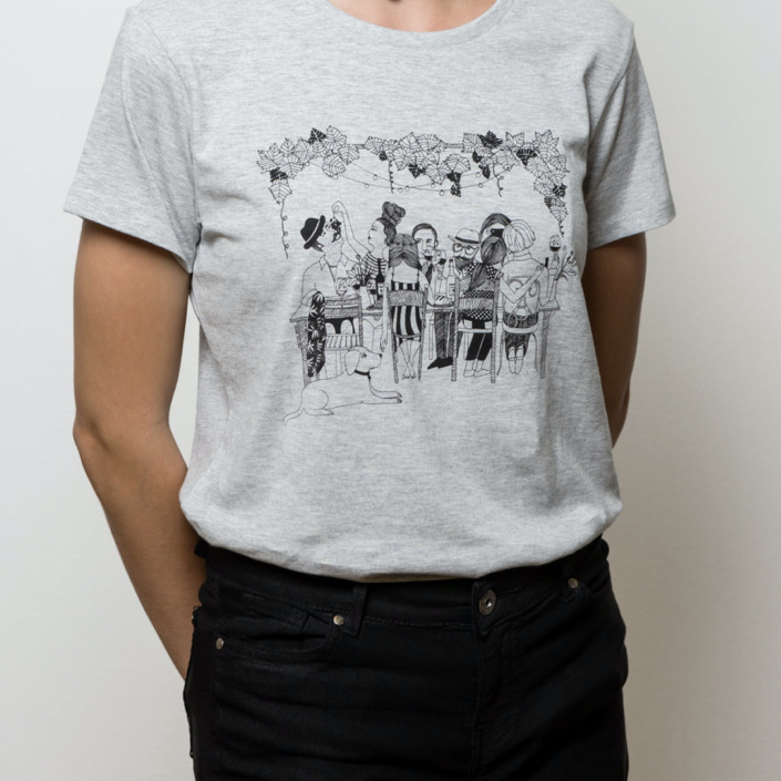
The t-shirt is available
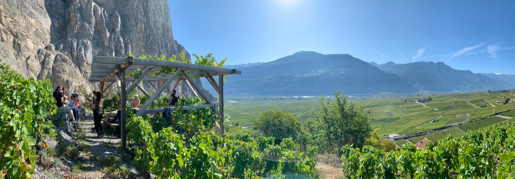
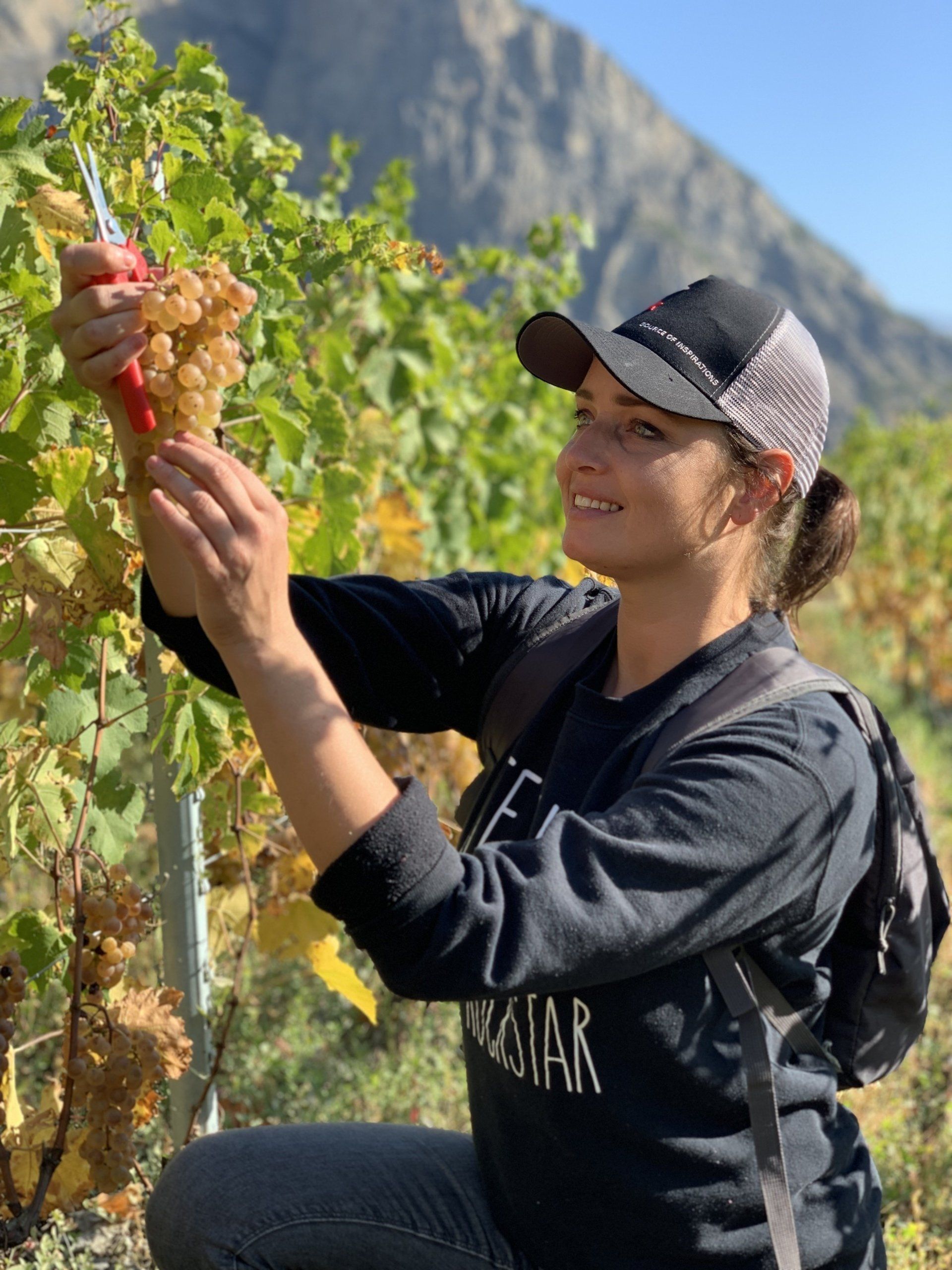
After completing this assignment, my agent and I were invited to a weekend in Switzerland where we could see the Tavolata first-hand and taste the wine. In addition, we were also allowed to help pick during the Grape Harvest for a day. A fantastic experience to get to know the client and the brand in this way. That is what makes my profession as an illustrator so varied and fun. In addition to diving into the product or brand, I also come to very special places.
Are you also working on a brand or brand and are you thinking about using illustrations?
info@melaniedrent.nl